Rooted in community, built on service and established by trust.
Contents
Brand Story
Carmigo started as a marketplace for consumers to sell cars to dealers, but we quickly learned that our dealers were hungry for more options when it came to online wholesale.
So we built Carmigo to be an auction that works with dealerships, not against them. Now with more than 10,000 cars sold on the platform, we’re on a mission to help dealerships across the south do wholesale better.
Brand Story
Carmigo is the South's Online Auto Auction
Carmigo’s secret sauce is a mobile-friendly vehicle inspection tool and dealership-to-dealership platforms with both revolving daily inventory and timed listings.
We offer our daily Live Auction for dealers that need to move inventory fast and the Carmigo Marketplace for dealers that can afford to sit on used inventory.
Sellers can list in two ways: manually, or by setting up inventory integrations.
Buyers can either bid on our live auction or place offers on the Carmigo Marketplace.
Brand Story
The Difference
There’s a reason we’re the South’s Online Auto Auction
Trust
Our transparent bidding process and verified listings ensure you can buy and sell with confidence. Our arbitration rate is <1% if you need a proof point.
Service
Our dedicated team of Carmigos is eager to assist you at every step of your auction experience. We don’t believe in elevator music around here.
Community
Be part of our network of buyers and sellers who share a love for cars and a commitment to fair deals (and the occasional Carmigo cookout).
Tone
Carmigo’s platform is designed to create a win-win transaction for our buyers and sellers. It’s easy to use, easy to understand, and usually makes everyone happy. That’s why Carmigo’s communications are easy to understand, helpful, and usually make sense.
EAGER TO HELP
You know that friend who is always trying to help — like maybe a little too much? That’s us. Yep, we’re a bunch of try-hards and we admit it. We just want to help.
EASY
If it’s not easy, it’s not Carmigo. Our communications must be easy to read, hear, see, and understand. Always be earnest, direct, and helpful. No need to be difficult or waste someone’s time.
FUN
Carmigo isn’t one of those companies that says, “We make (insert difficult thing here) fun. Selling your car isn’t fun. But while we’re here, we might as well have a little fun, right?
Voice
What We Say
Make things easier.
We root for our buyers and sellers. If they can get a better deal somewhere else, we support them. We’ll gladly sell a car to Carvana any day of the week. Then we turn around and try to make our deals better.
We wave the banner for being easy. When we see people and brands striving to make life easier, we celebrate them.
We know there is a better way to sell your car, and we believe it is Carmigo.
What We Don't Say
• We don’t punch down. We don’t go after disgruntled sellers, we don’t slam car dealerships, we don’t have competition because we can be a great partner for anyone.
• We don’t explicitly mention dealerships when comparing Carmigo to trade-ins.
• We don’t use explicit language. Keep it clean, keep it chill, keep it easy (no cussin or dirty stuff).
Style Guide
Carmigo communications will refer to all vehicles as cars. It’s just easier
Carmigo should be referred to as a marketplace or auction.
Carmigo does not have customers. We have sellers and buyers.
Carmigo does not buy or purchase cars, nor do we make offers on cars.
When speaking or writing on behalf of Carmigo, we use plural first-person pronouns (we and us).
Anyone working at Carmigo is a Carmigo, as in car amigo.
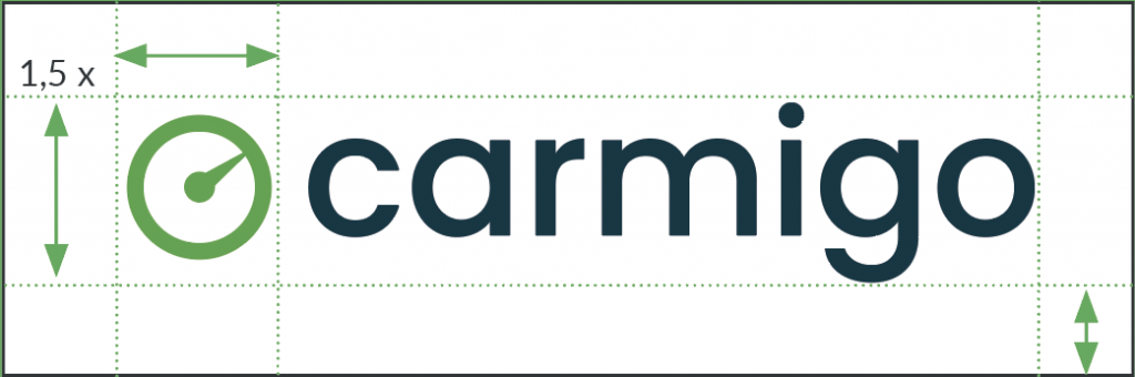
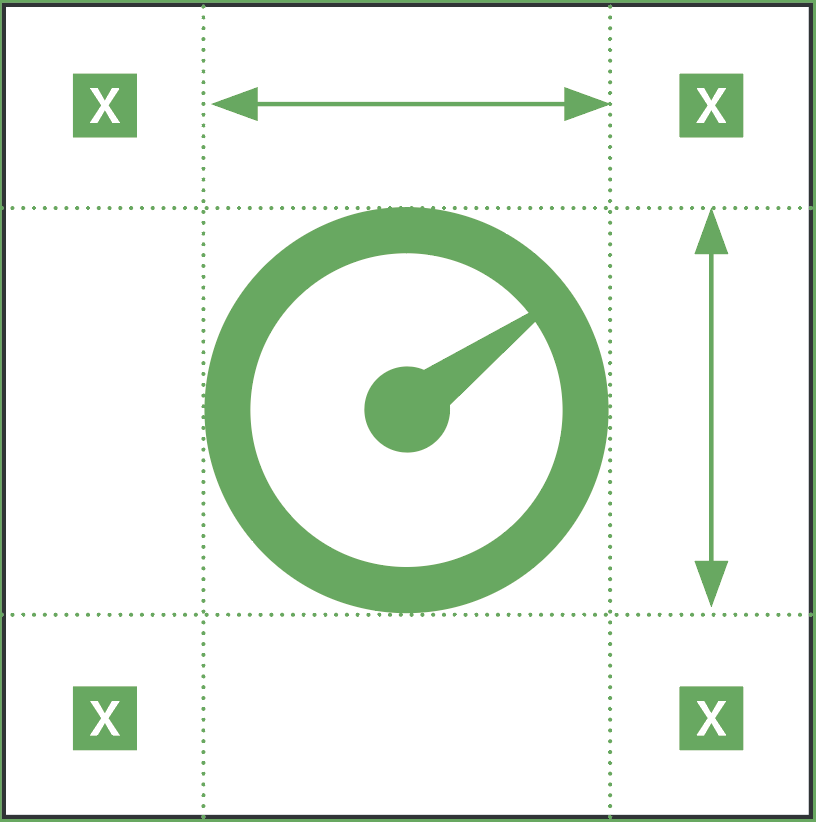
The Carmigo logo combines three elements: The stylized speedometer icon, the typography and the color scheme.
Wherever possible, the logo should utilize the green icon and navy text. In other cases, it should greatly contrast with its background so long as the green icon is easy to decipher.
Clear Space
The Carmigo logo requires separation from the other elements around it. The space required on all sides is roughly equivalent to the cap height of the logo type.
If you use the logo icon as a single object, it also needs clear space all around.
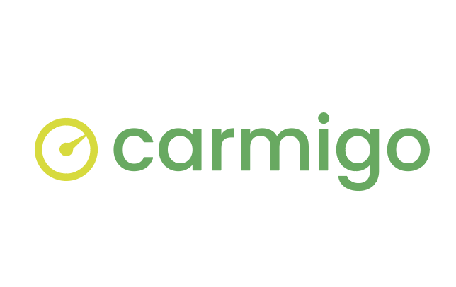
DO NOT
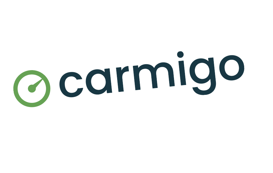
The logo cannot be changed! Although creativity is appreciated please do not alter the logo in anyway.
DO NOT rotate the logo
DO NOT add a drop shadow
DO NOT rearrange elements
DO NOT stretch the logo
DO NOT use different colors
DO NOT use a gradient
Design Toolkit
Lockups
Carmigo logo lockups are comprised of the primary logo + corresponding name set in Poppins semi bold.
Partnership lockups utilize a 2 px thick horizontal or vertical line that is 75% of the logo height or width. Both logos should have equal visual weight.
Design Toolkit
Color
Carmigo Green is our primary brand color.
Our navy blue is used as a primary color to provide contrast and our mint green is used as a grounding neutral.
We also have a secondary color palette to provide flexibility while creating a unified, recognizable appearance across all communications. These colors are complementary to our official colors, but are not recognizable identifiers for our company. Use the bright yellow sparingly.
The primary font for Carmigo is Poppins. It should be used in all Carmigo communications to project a consistent visual identity. This includes promotional materials, advertising, digital assets, and printed materials.
Headline Title Case
Font/Weight
Poppins Extra Bold
Headline Alternate
Poppins Bold
Subheadline
Web: Merriweather
Print: New Spirit
Body Copy
Lato Normal
Design Toolkit
Iconography
We use a series of icons to tell our story and help the user easily navigate through content.
Our utility icons are simple in nature, used for navigation, notification and reminders. Pictograms are used to represent more detailed information.
Design Toolkit
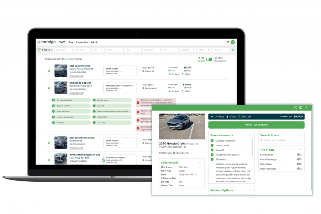
Imagery
Carmigo’s imagery style evokes a feeling of innovation and advancement. We aim to use product mockups when showcasing or introducing our latest innovations.